
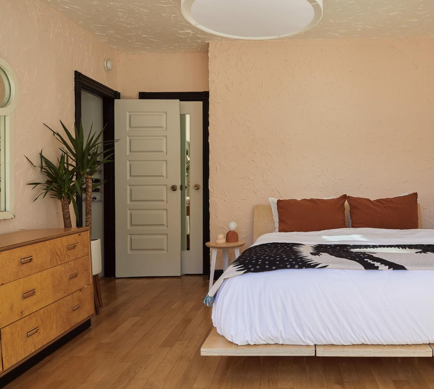
Test Apartment Paint Colors in the Light You Actually Have
The designers in the source caution that intense red, orange, and yellow can dominate a small apartment. They also note that deep brown or navy may feel heavy, while an unsuitable white can appear clinical. These are design judgments rather than universal effects.
Warm off-white is offered as an alternative, with stronger colors used in smaller accents. Test samples under the studio's daylight and evening lighting before committing. Consider fixed flooring and furniture too, since the wall color will be seen alongside them throughout the open room.
Treat the strong color advice as preference rather than fact
The designers in the reference discourage some bright reds, oranges, yellows, and heavier dark tones, while suggesting softer or warmer alternatives. Those opinions do not establish that a color universally causes anxiety or makes every small home feel smaller. The useful question is how the particular tone, amount of coverage, and available light interact with the room and the people using it.
Use smaller accents when repainting is impractical
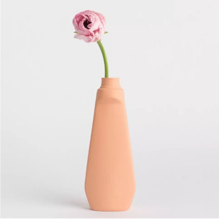
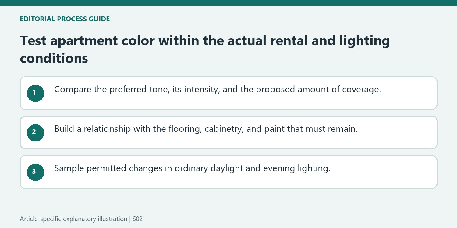
Its suggestions include mauve, burgundy, and paler yellow as alternatives to brighter versions. The article acknowledges rental restrictions and discusses introducing color in smaller doses. An artwork, textile, or piece of furniture can test a preferred hue without changing all the walls. If repainting is permitted, sample more than one wall and observe the proposed white or stronger shade through the day and under evening lamps. A cool white may appear different beside warm flooring, while a richer color can be useful in a limited area. Choose from those actual observations rather than treating a list of colors to avoid as a rule for every apartment.
Separate intensity, coverage, and personal preference
The reference discourages several bright or deeper colors while offering softer alternatives. Treat those comments as the interviewed designers' preferences, not a rule that red causes the same emotional response in everyone or that dark paint always reduces a room's appeal. Compare how much of the selected tone will be visible and which surfaces carry it. A small orange object has a different role from orange across the whole room, and a burgundy textile introduces another level of saturation. An illustrative test could compare a favorite accent with the fixed flooring and sofa before considering paint. The decision should respond to the household's actual preferences and the available lighting, rather than a color's place on an avoid list.
Make the unchangeable surfaces part of the starting palette
The article recognizes that renters may have to keep existing paint and finishes. Identify the flooring, cabinetry, and wall color that will remain, and compare textiles or artwork that make those elements look deliberate together. Hooper suggests a more dramatic decorative direction as one option for darker walls; that does not mean every rented room needs maximalism. A quieter supporting textile may be more useful where the existing space is already visually busy. Small accents also allow a favorite hue to appear without requiring permission to repaint. Select a useful object and a clear material relationship instead of trying to hide an unwanted wall behind many competing colors and unrelated accessories.
Test any permitted paint change at the intended scale
If repainting is allowed, verify the agreed scope and compare actual samples under the normal daylight and lamps. The source's off-white and taupe suggestions are starting points, while their undertones still need assessment beside the retained materials. Its idea of continuing a color across walls and trim also involves finishes appropriate to different surfaces; a shared color name does not make the same coating suitable everywhere. Check preparation and application guidance for the products chosen. A painted arch or ceiling introduces a different amount of color from four complete walls, so test the proposed treatment rather than only a tiny isolated swatch. Keep the result connected to the way the apartment is used and to what can realistically be changed later.
References
- 5 colors you should skip using in a small apartment, according to a designer. Real Homes; Kara Thompson.
Warm neutrals and restrained accents may feel different from bright or heavy wall colors.


Leave a Comment