
Choose a Living Room Neutral with Its Lighting in Mind
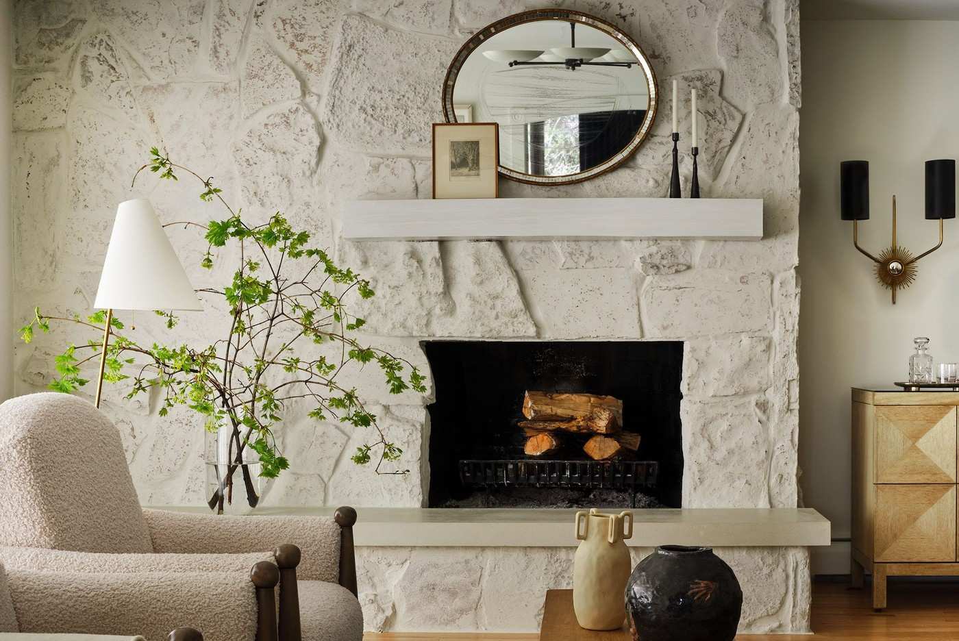
Good Housekeeping's paint examples show that a neutral can shift with the light and surrounding furnishings. Designers discuss a warm off-white as a calm foundation and a gray that balances statement furniture and artwork while appearing different between day and evening.
Those relationships matter in a small living room, where the walls remain a large part of the view. Compare a candidate shade with the upholstery and lighting rather than selecting from a name alone. The aim is a backdrop that supports the room's actual materials and daily conditions.
Compare undertones and the neighboring surfaces
Kate Hartman's warm off-white example is discussed for its response to changing light, while Rayman Boozer's gray balances stronger furniture and artwork. The reference also includes lavender, blue, wine, and olive, demonstrating that a supporting wall color need not always be pale beige. Look at the actual floor, upholstery, and trim before deciding which paint can act as a quieter foundation.
Read the designer's room as an example rather than a guarantee
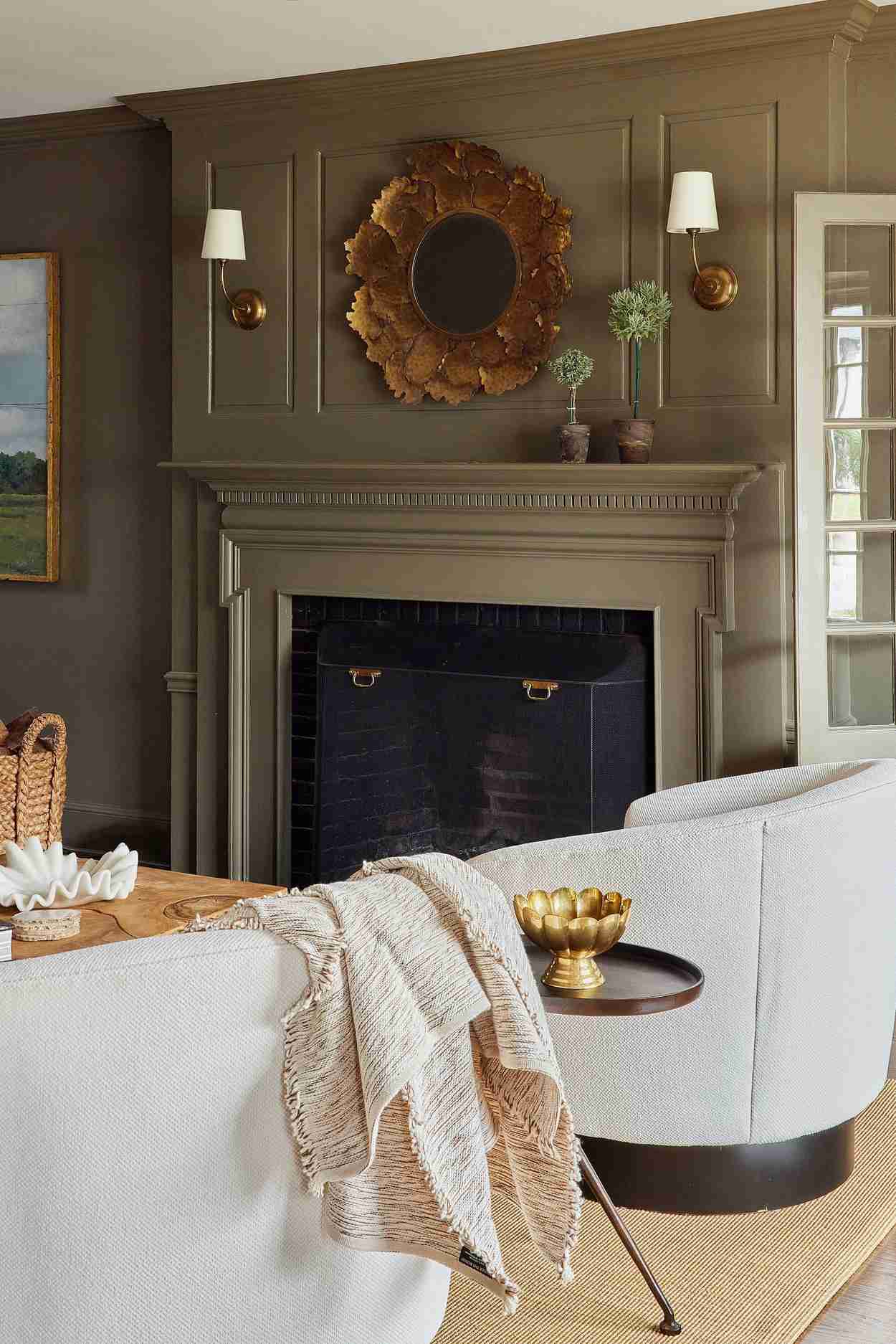
Ashley DeLapp uses richer shades to emphasize architectural detail, and Jessica Hobson relates olive to creams, browns, plums, and brass. Those relationships depend on the photographed rooms and their light. The source repeatedly connects the selected shade to surrounding architectural details and furnishings. Sample the proposed paint on more than one wall and view it at the times the living room is normally occupied. A shade that appears calm in one feature may look cooler, darker, or more saturated elsewhere. Current product names can help identify a starting sample, but the useful decision comes from observing the color in the intended setting.
Identify what the background needs to support
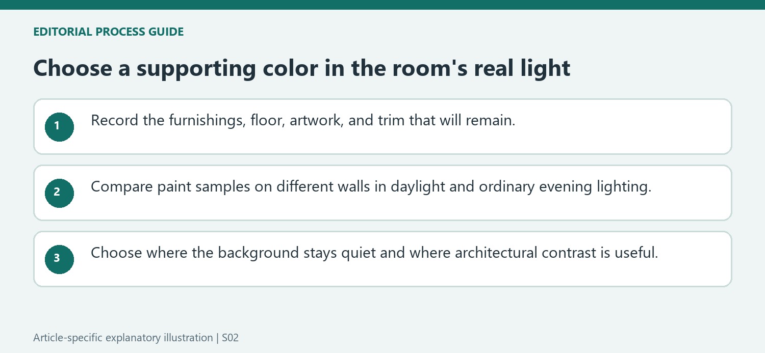
The source's off-white and gray examples work with specific furnishings and architectural details. List the sofa, floor, artwork, and trim that will remain, then decide whether the wall should quietly connect them or provide more visible contrast. A warm off-white might support one material group while looking mismatched beside another. The darker wine and blue examples also show that a supportive background does not always have to be pale. Their reported sense of depth is a designer's reading of particular rooms, not proof that every dark paint will enlarge a space. Begin with the required relationship and compare a small selection of actual samples instead of choosing solely from a name or a trend.
Observe the sample under the lighting used for ordinary evenings
Boozer describes a gray that changes its impression between day and night, while Hartman emphasizes an adaptable warm off-white. Those comments make the test conditions as important as the initial color choice. View a sample beside the actual upholstery and floor in daylight and with the normal lamps switched on. Compare more than one wall if the room receives uneven light. A photograph from the source cannot establish the same balance under different bulbs or windows. Keep track of the sample names and finishes so the preferred appearance can be linked to a specific current product, rather than a general description such as creamy, soothing, or neutral.
Decide where contrast belongs in the architecture
Marie Cloud's examples include dark definition on windows, doors, or millwork and, elsewhere, a stronger ceiling with lighter walls. Those are distinct ways to organize contrast. A small room may borrow one targeted detail without adopting a saturated treatment across every surface. Compare the existing architectural outlines and decide which deserve emphasis. Olive beside cream, brown, plum, or brass offers another relationship from the reference, but the complete group still needs testing together. Current coating instructions determine preparation, substrate suitability, and application regardless of the decorative choice. Select the final background by its performance in the actual material and lighting context, with a clear reason for each surface that will become lighter, darker, or more colorful. Keep the selected finish and product details with the samples so the final specification can be checked before purchase.
References
- 70 Chic Living Room Paint Colors Designers Use Over and Over Again. Good Housekeeping; Monique Valeris; Alyssa Gautieri.
Good Housekeeping's paint examples show that a neutral can shift with the light and surrounding furnishings.


Leave a Comment