
Use a Favorite Color Without Saturating the Whole Room
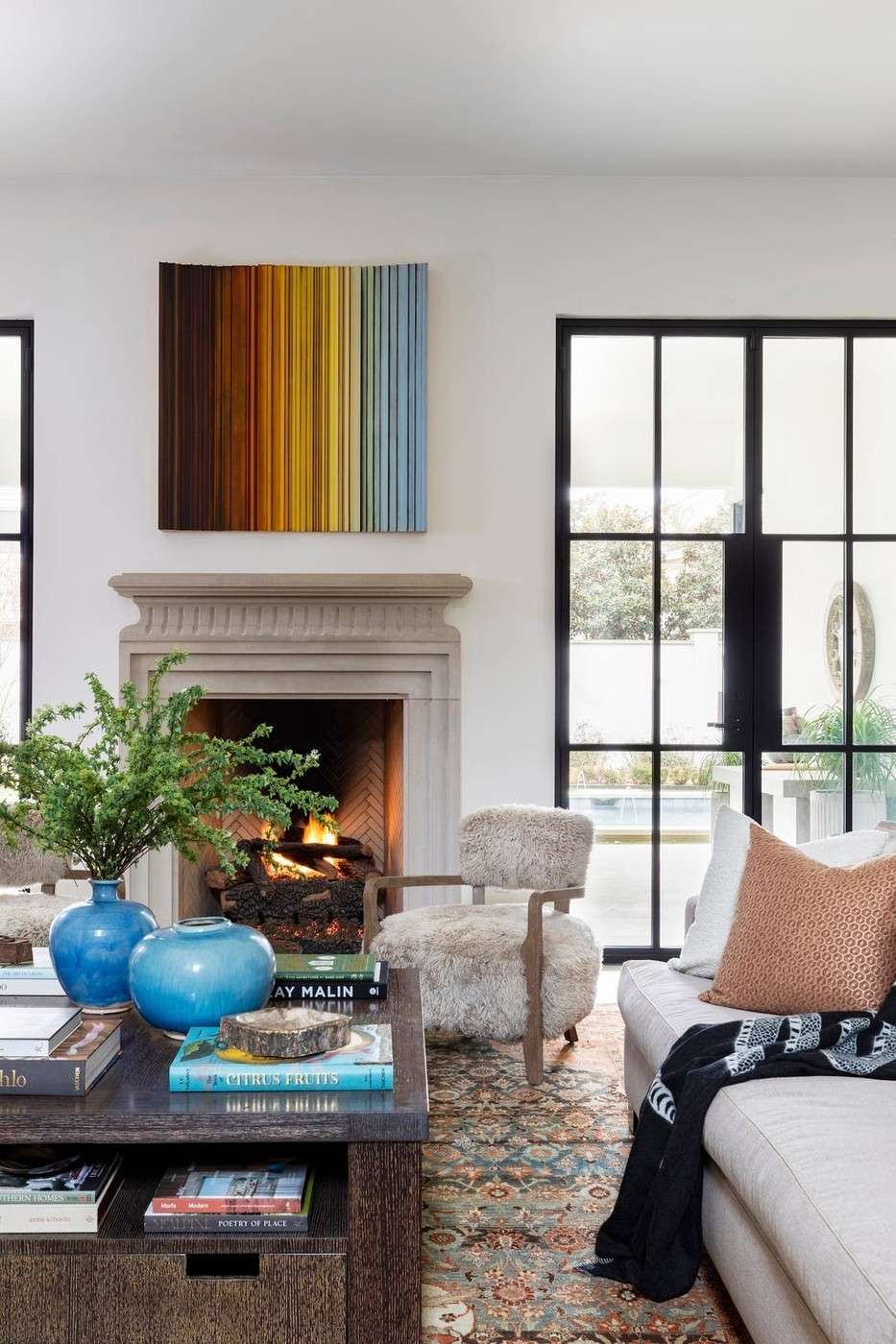
Enjoying a color does not necessarily mean wanting it on every living room surface. Designers interviewed by House Beautiful point out that the space is shared and that a favorite shade can feel different when it surrounds the occupants at full scale.
They suggest introducing it through upholstery, art, rugs, cushions, or smaller elements while keeping larger surfaces quieter. This can work well in a compact room, where a few accents are highly visible. Choose their placement around the existing palette and the preferences of everyone who regularly uses the space.
Consider the amount of color as well as the shade
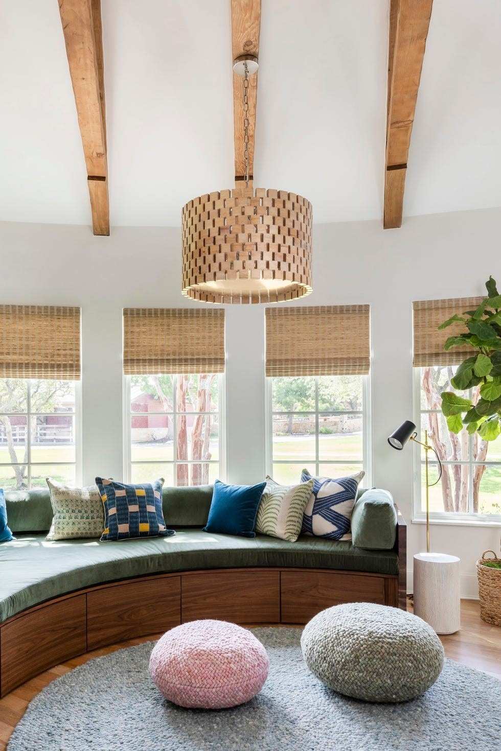
Blair Burton distinguishes loving a color in clothing or an accessory from living inside a room saturated with it. A shared living room also needs to reflect other household members' preferences. Compare a small repeat of the color with a larger painted area before assuming that more coverage will be more enjoyable. The source presents this as a design consideration, not a claim that favorite colors should be avoided.
Choose a layer that can evolve with the room
The article suggests upholstery, artwork, rugs, cushions, cabinetry, or smaller architectural accents as ways to introduce the chosen hue. A quieter large surface can allow those elements to change without repainting the whole room. Look at the color beside existing timber, flooring, and daylight rather than judging it only on a screen. A carefully selected sample cushion or artwork can establish whether the tone feels connected in everyday use. If the household later wants a stronger version, the smaller accent provides a useful reference for selecting paint or a larger textile.
Consider how much of the shade the shared room can support
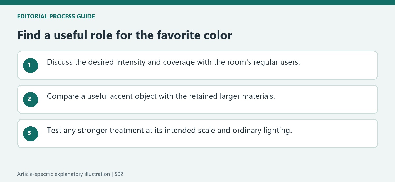
Burton's distinction is about scale of experience: enjoying a color on a favorite object differs from seeing it on the walls, ceiling, and millwork at once. Ask the other regular users which version of the shade they enjoy and whether it should lead or support the scheme. An illustrative first step might compare a vivid cushion with a larger muted textile in the same family. Neither choice rules out painted walls later. It simply reveals whether the preferred relationship is a small accent, a substantial furnishing, or a more enveloping background. A shared room should reflect that conversation rather than treat one person's longest-standing favorite as the only design requirement.
Choose the object by its place in the existing composition
The source lists upholstery, rugs, art, cushions, and smaller architectural details as possible carriers of color. They occupy different amounts of visual space and require different commitments to change. A patterned artwork may already contain the shade, making a second large object unnecessary. Alternatively, a useful chair could supply both the missing seat and the desired accent. Compare the hue against the retained sofa, wood, and flooring in the room's ordinary light. A screen image or isolated fabric sample cannot show the complete relationship. The aim is to give the favorite color a useful role rather than collect several unrelated objects merely because they share its name.
Leave a clear route for the scheme to evolve
A quieter large surface can allow the smaller colored elements to change over time, as Burton suggests. That flexibility is most useful when the retained background genuinely works with the different tones under consideration. Keep labels or samples for any fabric and paint selected, and compare future additions against the actual materials. If a stronger color treatment is later chosen, assess its full intended area under daytime and evening lighting rather than simply enlarging the first accent by assumption. The source warns that saturation can become tiring, but does not establish that everyone will react the same way. Personal preference, other occupants, and the room's ongoing use should guide the amount of color as much as the initial enthusiasm for the shade. A modest successful accent can remain the finished scheme if the household already enjoys the resulting balance.
References
- Designers Say You Shouldn’t Paint Your Living Room Your Favorite Color—Here’s Why. Good Housekeeping; Wendy Rose Gould.
Enjoying a color does not necessarily mean wanting it on every living room surface.


Leave a Comment